Advertising layout

In all print advertising (regardless of size or orientation) the NCR logo must maintain visual prominance.
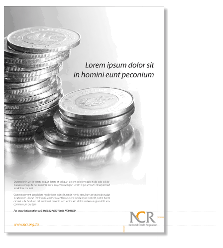
The logo must always appear on the bottom right corner of the format with the minumum clearspace around it. This comprises 2x the height of the letter “R” in the logo strap line (as per this example).
The visibility of a logo should not be confused with its size on a page. A logo carries maximum visual weight not by a large size relative to its substrate, but by the amount of clear-space it commands around it. Disproportionately large logos appear clumsy and unattractive and do not add to its visual impact.
The headline must be set in 30 pt Myriad Pro Italic on 36 pt leading. The heading may be ranged left, right or centered to suit the individual application.
The body copy is to be set in black 10 pt Myriad Pro Light on 12 pt leading and should be justified. One, two or three columns may be used depending on space and the application. Address and contact details should form part of the final paragraph of the body copy and be set in Myriad Pro Semibold Italic 10 pt.
The website address must feature on all advertising as a standard element on the left bottom corner (opposite the logo).
On advertisements where the size is roughly A4, the website address should be set in 15 pt Myriad Pro Italic and 24pt when the size approximates A3. The website should appear in orange when the advertisment is in colour and in 50% black when used for a black and white application.
Recommended size of logo
The recomended size for the logo in various applications has been calculated according to the golden mean for a visually harmonious proportion and are as follows:
A6 – Logo width of 21mm or 30mm
A5 – Logo width of 30mm or 43mm
A4 – Logo width of 43mm or 60mm
A3 – Logo width of 60mm or 86mm
A2 – Logo width of 86mm or 120mm
A1 – Logo width of 120mm or 172mm |